
Benchling
A marketing site that could scale with the product.
Inside the system- Client
- Benchling, via Code & Theory
- Role
- Site architecture, components, visual design
- Team
- One of three designers
- Duration
- 3 months
Benchling’s R&D Cloud filmFrom the Code & Theory engagement I was part of. I was one of three designers on the site, designing its modules and doing visual design with that team.
Summary
Benchling’s marketing site hadn’t kept pace with its R&D platform. We gave it a high-end visual language and a system of reusable zones and components, so each new product page, use case and landing page could be assembled instead of started from scratch.
Site architecture, components and visual design, as one of three designers at Code & Theory, alongside a UX designer and a visual designer.
What Benchling is
The life sciences
R&D cloud.
Scientists use Benchling to design DNA and proteins, record experiments, register molecules and track samples, in one place.
Much of it begins with a sequence. A plasmid, a small ring of DNA, is drawn as a circular map, with every feature in its place along the ring.
Context: Benchling at its Series F, November 2021, as the company reported it
Valuation at the Series F
Companies using the Benchling R&D Cloud
Scientists in the Benchling community
The challenge
It wasn’t just about making it look better. It was about making it scale.
Site architecture
Every page type, sorted into a template.
Three templates were redesigned. Eight carried existing pages over one to one, onto the new platform and into the new brand. The help center, sign-in and developer pages stayed out of scope: no replatforming, no visual updates.
Transcribed from the original template guide.
Zones and components
One template.
Three different pages.
Zone diagrams made the content strategy concrete. A stable opening and close gave each page a recognizable shape; the open module area let the team assemble the right story in between.


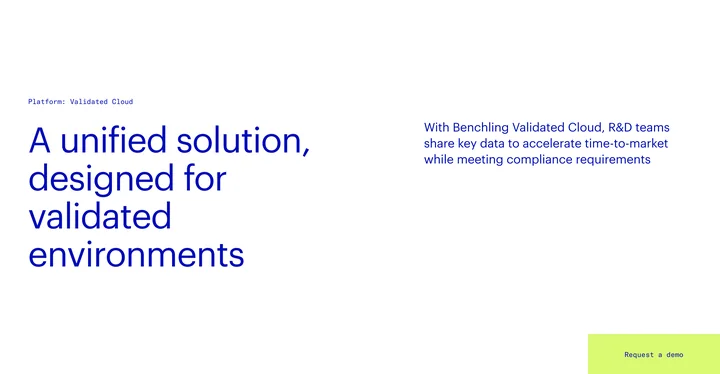
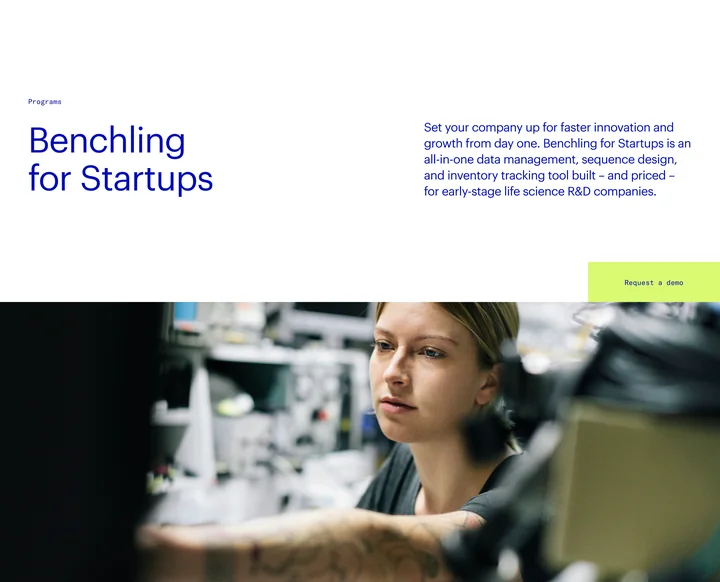
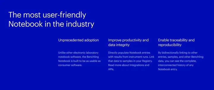
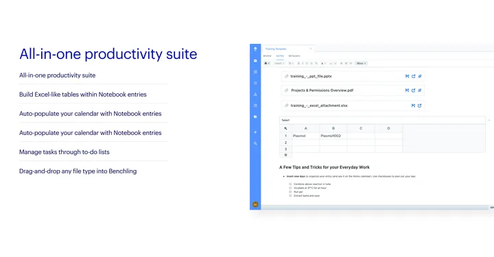

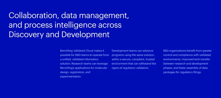
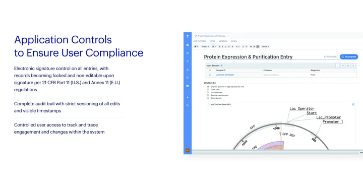
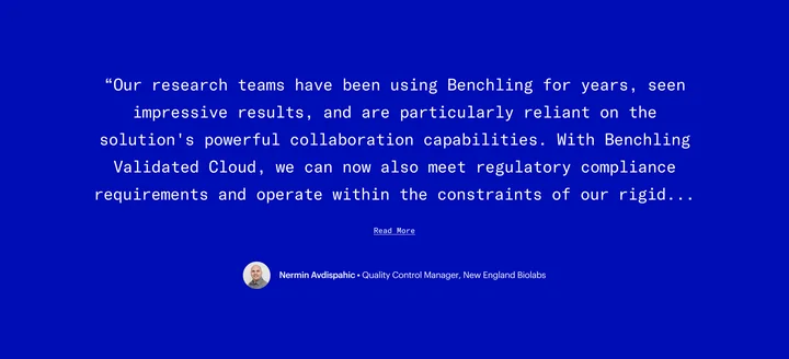
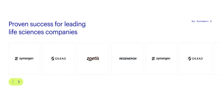
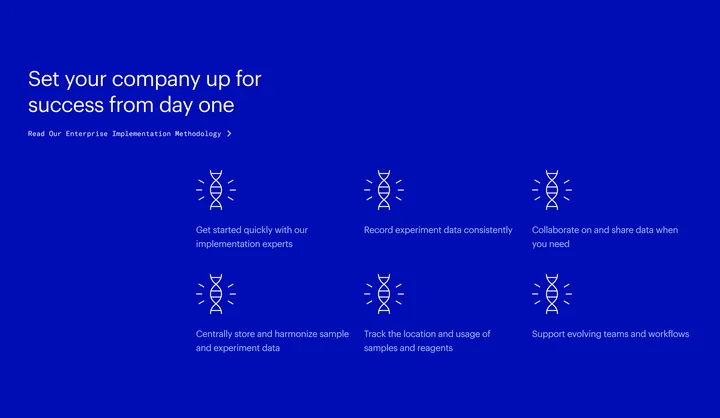

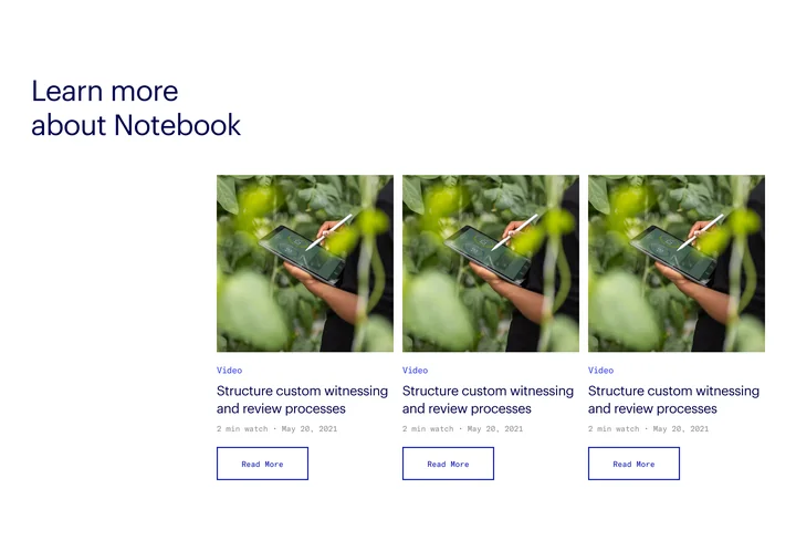
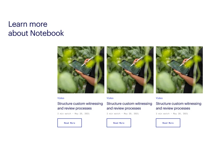

Cut from the original page comps, each open module area shortened to three of its modules, and aligned to the Product detail zone diagram in the template guide. Navigation and the CTA breaker are the same component on all three pages; these comps stop before the footer, so it stays a zone.
One visual language,
every kind of page.
Deep blue, a signal lime and scientific imagery, from the homepage hero to the closing call to action.

Handoff
A production blueprint, not a style guide.
The template guide documented every component across desktop and mobile: layout, spacing, content requirements and responsive behavior.
It gave engineering and content teams what they needed to build and extend the site on their own.

Outcome
With the Code & Theory team, I delivered a reusable page architecture, a component system and a responsive template guide. Design, engineering and content teams had a shared specification for assembling the next product story.
Credits
- Role
- Site architecture, components, visual design
- Team
- Three designers at Code & Theory: a UX designer, a visual designer and me
- Worked with
- Code & Theory and Benchling’s marketing team
- Deliverables
- Content strategy, zone diagrams, visual design, component architecture, template guide
- Platform
- Web, desktop and mobile
- Duration
- 3 months
The opening loop is cut from Benchling’s R&D Cloud film, from the same Code & Theory engagement; my part was the site, not the film. The plasmid map is an illustration of the domain, not a product screen. Every page image is cut from the original comps. The homepage and template guide films move across those originals; they are not recordings of the live site. Context figures are Benchling’s own and are not results of this project.