- Client
- Goldman Sachs Asset Management
- Role
- Product designer
- Duration
- 1 month
- Platform
- Web app
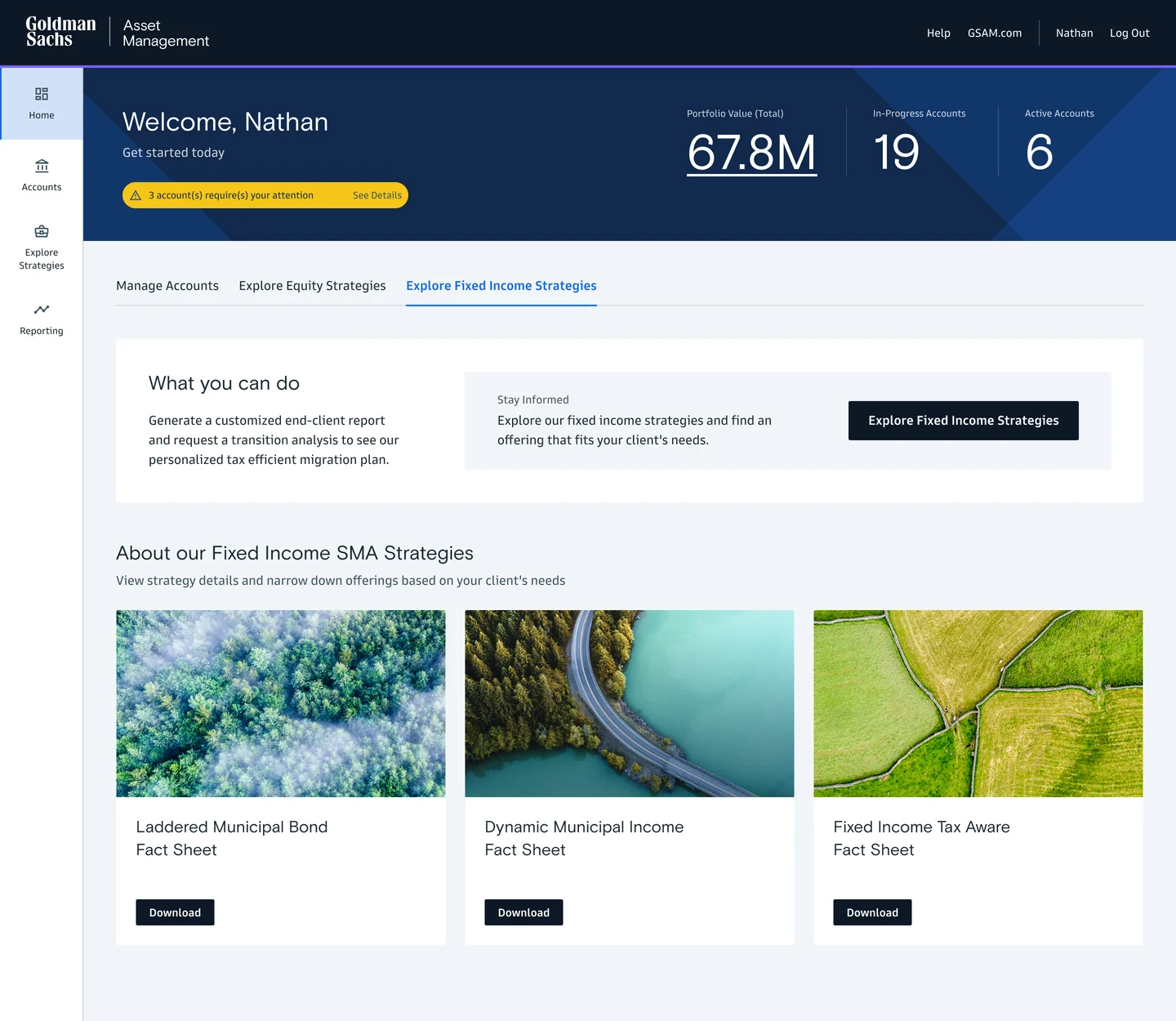
Illustrative layers beneath the original dashboard design.
The problem
An advisor inside the firm had built a set of spreadsheets for evaluating and recommending investment strategies. It worked for her. It didn’t scale across the firm, or to the registered advisors who use the Goldman Sachs franchise.
Product designer. I worked with her as product owner, another UX designer and a visual designer, inside Goldman Sachs’s existing visual language.
The brief
Give specialist knowledge a shared interface.
Choose a strategy
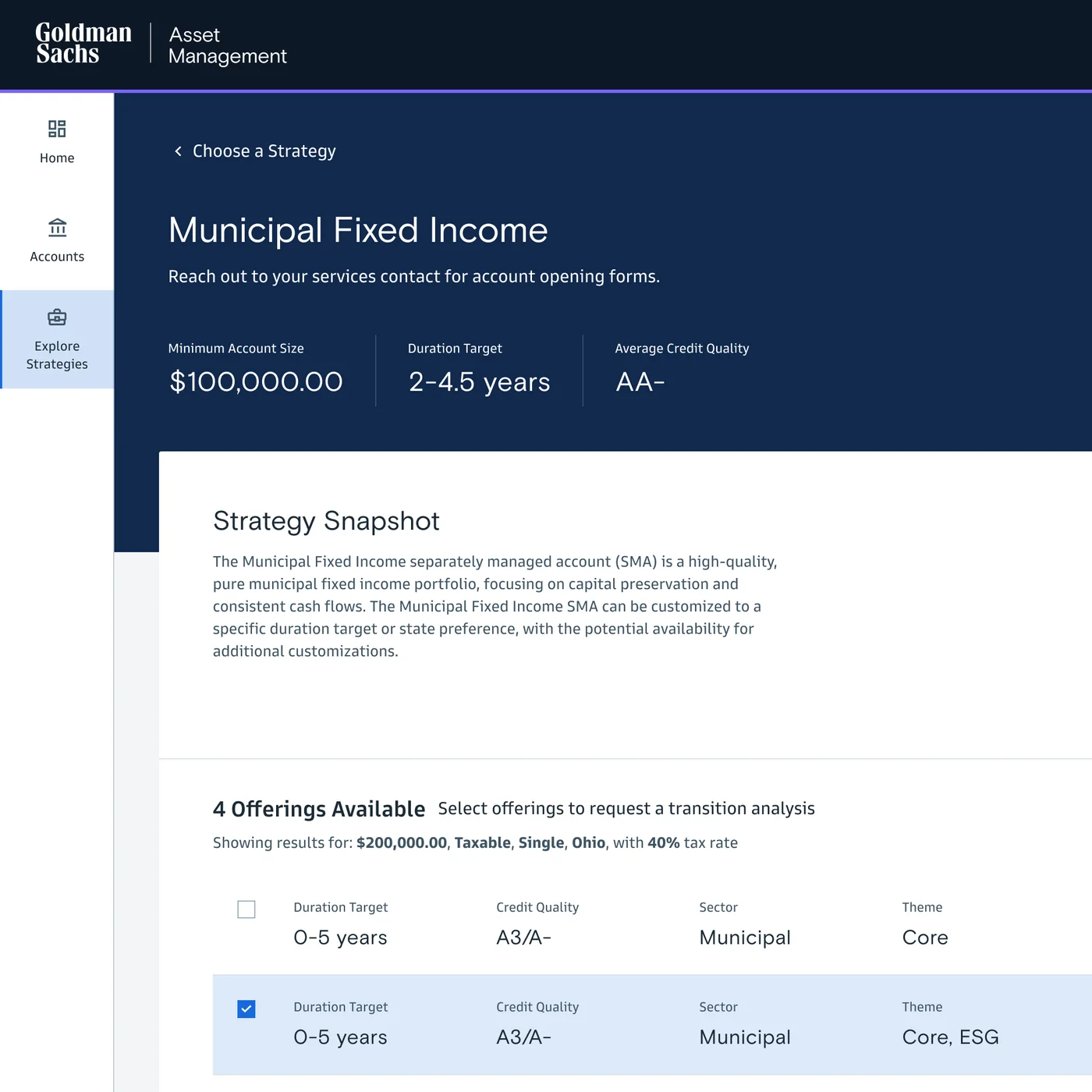
Make the comparison specific to the account.
The account’s tax context comes first, then every strategy and offering is compared for that client, then the next analysis. The tour plays on its own; choose any step.


Tell us about this account
Taxable income, tax status, filing status and state of residence.
Rebuilt in code from the original screens, with every figure as it appears there. Inter stands in for the Goldman Sans display face.
Progressive disclosure
A clean overview first. Depth only when it’s needed.
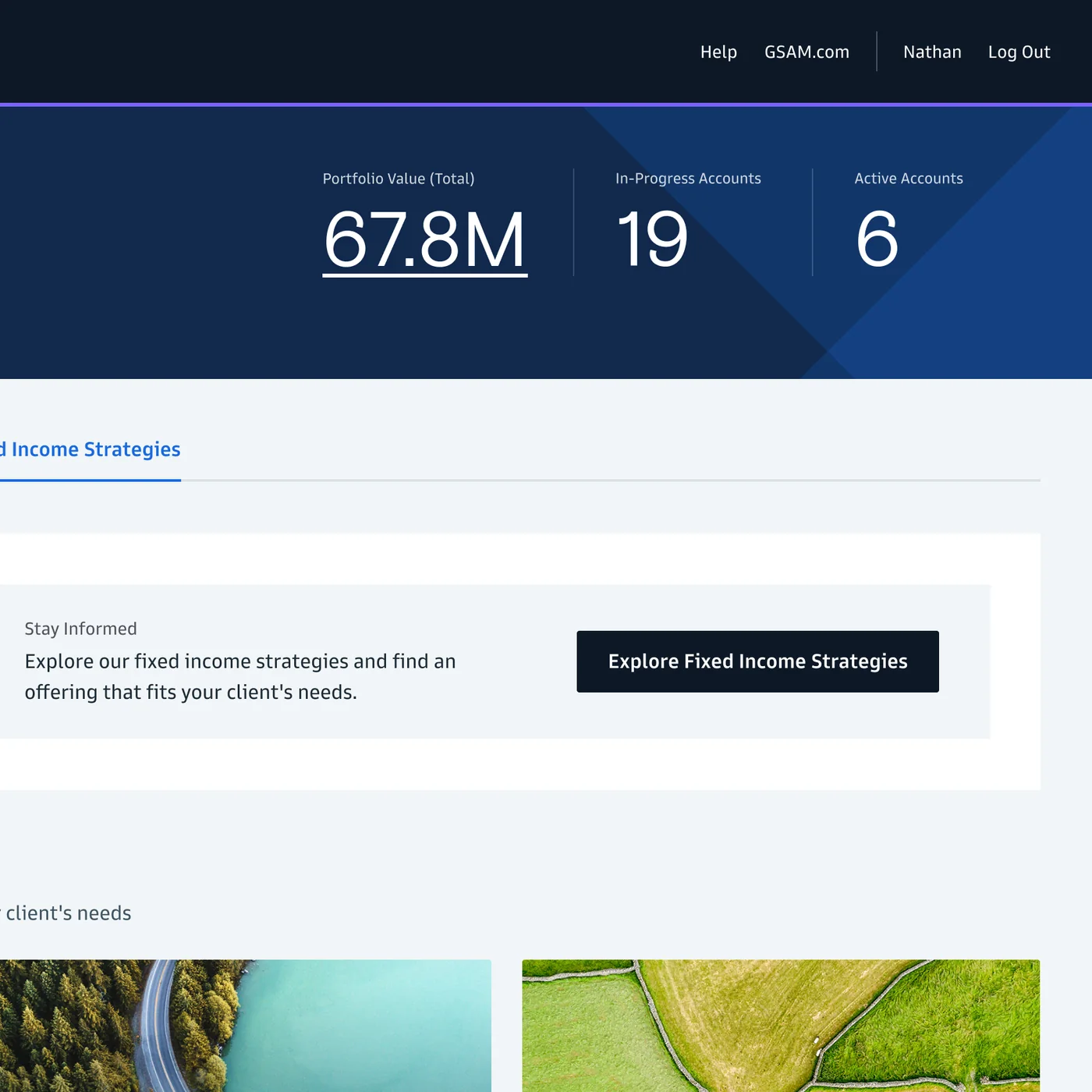
I designed strategy selection with progressive disclosure: advisors start with a scannable overview of strategies and their offerings, then open a strategy only when they need depth.
Each strategy keeps its snapshot, its offerings with yield and duration, and the research and fact sheets together, so the request for a transition analysis starts in context.
One workflow
Account context, offering comparison and transition analysis, in one advisory workflow. Working with the advisor as product owner kept her domain reasoning close to every interface decision.
Credits
- Role
- Product designer
- Work
- Product design, information architecture, interaction design
- Worked with
- The internal advisor as product owner, another UX designer, a visual designer and the engineering team
- Client
- Goldman Sachs Asset Management
- Platform
- Web app
- Duration
- 1 month
The strategy screens on this page are rebuilt in code from the original screens, with every figure as it appears there; Inter stands in for the Goldman Sans display face. The spreadsheet and wireframe planes in the opener are illustrative.